LinkedIn posts have no bold or italic button, so a LinkedIn text formatter is how people do it: you type your text into the formatter, pick a style like bold or italic, then copy the result and paste it into the post composer. The formatter swaps your letters for Unicode lookalike characters, which is why the styling survives the paste.
Line breaks, emojis, mentions and links work in a post without any tool. Real bold, italics, headings and clickable text links only exist in LinkedIn articles and newsletters.
This guide shows what LinkedIn supports where, how to bold, italicize and underline text on desktop and mobile, how to add bullets, spacing and links, and the trade-offs most formatter pages leave out: screen readers, search and the "see more" fold.
Can You Bold or Italicize Text on LinkedIn?
Not in a regular post. The post composer is plain text: you can add line breaks, emojis, hashtags and @mentions, but there's no toolbar for bold, italics, underline or font size.
Articles are different. LinkedIn's long-form editor, which you open with Write article from the share box, has real formatting, and that's also the editor newsletters use. Here's what works where:
| Where you write | Built-in formatting | Length limit | Clickable text links |
|---|---|---|---|
| Posts | Line breaks, emojis, hashtags, mentions | 3,000 characters | No, only pasted URLs |
| Comments | Line breaks, emojis, mentions | Shorter than posts | No, only pasted URLs |
| Articles and newsletters | Bold, italics, headings, lists, links | 125,000 characters | Yes |
| Profile headline, About, Experience | Line breaks in About and Experience | Varies by field | No |
The 3,000 character limit for posts is on LinkedIn's help page for posting and sharing updates, and the 125,000 character limit for articles is on its page on the differences between posts and articles.
So if a piece needs headings, real bold and linked words, write it as an article. Our walkthrough on publishing a LinkedIn article step by step covers the editor, and the same tools apply when you're starting a LinkedIn newsletter.
Takeaway: For a post, plan on plain text plus line breaks; for anything that needs real formatting, use an article.
How a LinkedIn Text Formatter Works
Unicode, the standard that tells every device how to display text, includes full alphabets of bold, italic, script and monospace letters. They were added for math, but they look like styled versions of normal letters.
A formatter maps each letter you type to its lookalike. So "Bold text" becomes "𝗕𝗼𝗹𝗱 𝘁𝗲𝘅𝘁" and "italic" becomes "𝘪𝘵𝘢𝘭𝘪𝘤". LinkedIn treats them as ordinary characters, which is why they paste in and stay styled.
Underline and strikethrough work differently. The formatter adds a combining mark after each letter that draws a line under or through it, which is why underlined text can look patchy on some screens.
The styles most formatters offer:
| Style | Example | Best use |
|---|---|---|
| Bold (sans) | 𝗞𝗲𝘆 𝗽𝗼𝗶𝗻𝘁 | One key phrase or a short heading inside a post |
| Italic (sans) | 𝘒𝘦𝘺 𝘱𝘰𝘪𝘯𝘵 | A quote, a book title or a single word of emphasis |
| Bold italic | 𝙆𝙚𝙮 𝙥𝙤𝙞𝙣𝙩 | Rarely; it's harder to read at phone sizes |
| Monospace | 𝙺𝚎𝚢 𝚙𝚘𝚒𝚗𝚝 | Code, commands or a product name |
| Underline | K̲e̲y̲ p̲o̲i̲n̲t̲ | Avoid; it looks like a link that doesn't work |
| Strikethrough | K̶e̶y̶ p̶o̶i̶n̶t̶ | A playful correction, once per post at most |
Takeaway: A formatter doesn't change LinkedIn; it swaps your letters for symbols that look styled.
How to Bold Text in a LinkedIn Post
On desktop
- Open any free LinkedIn text formatter in your browser.
- Type or paste the words you want in bold. Keep it to a phrase or one line.
- Select the Bold style, or highlight the words and click B, depending on the tool.
- Copy the converted text.
- On LinkedIn, click Start a post at the top of your homepage.
- Paste the text into the What do you want to talk about? field and finish the rest of your post.
- Click Post, or the clock icon if you want to schedule it.
In the LinkedIn mobile app
- Open the formatter in your phone's browser, type your text and pick Bold.
- Tap Copy, or press and hold the text and choose Copy.
- Open the LinkedIn app and tap Post in the navigation bar.
- Press and hold in the What do you want to talk about? field and tap Paste.
- Tap Post in the upper right.
The steps are the same for a comment: convert the text, copy it, then paste it into the comment box.
A faster habit is to write the whole post in one place first, then bold only the one line that matters. Most formatters let you paste a full draft and style just the words you highlight.
Takeaway: Write first, format last, and bold one line rather than the whole post.
How to Italicize, Underline or Strike Through Text
The flow is identical to bold: convert, copy, paste. Pick Italic, Underline or Strikethrough in the formatter instead of Bold.
Italics are the subtle option. They suit a quoted line, a title or a single word you'd stress if you said it out loud. A full italic paragraph is tiring to read on a phone.
Underline is the one to skip. On LinkedIn, readers expect underlined text to be a link, and these underlines go nowhere. Strikethrough works as a joke ("S̶p̶e̶n̶t̶ t̶h̶r̶e̶e̶ w̶e̶e̶k̶s̶ o̶n̶ a simple fix") but loses its punch if you use it twice.
Takeaway: Use italics for a word or a quote, and leave underline out of your posts.
The Catch: Screen Readers, Search and Hashtags
Styled Unicode looks like text to you, but software sees different characters. Three things change.
Screen readers vary. In accessibility consultant Adrian Roselli's screen reader tests, JAWS announced each fake bold and italic letter one at a time, while NVDA, VoiceOver, Narrator and TalkBack read them as regular text. If your audience includes people using JAWS, a bold sentence can turn into a long string of separate letters.
Search won't match it. A styled keyword is a different set of characters from the plain word, so it won't match a plain text search for that word, as one recent formatting guide points out. That matters most in your profile, where recruiters search by job title and skill.
Hashtags stop working. A hashtag in styled letters is decorative text that links nowhere. Keep every hashtag and @mention in plain text.
There's also a display risk. Older Android versions and some locked down work computers can show empty boxes instead of the styled letters, so the most important words in your post are the ones you shouldn't style.
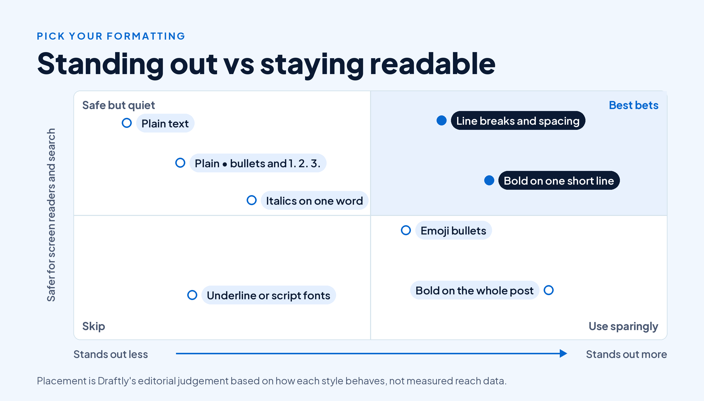
LinkedIn hasn't published any rule that styled text reduces reach. The cost is to readability and search, and it grows the more of the post you style.
Takeaway: Keep keywords, hashtags and mentions plain, and limit styling to one short line.
How to Add Line Breaks and Spacing on LinkedIn
Line breaks are the formatting LinkedIn supports natively, and they do more for readability than any font. Press Enter (or Return on a phone keyboard) to start a new line, and press it twice to leave a blank line between blocks.
A few rules that keep a post easy to scan:
- One idea per block. Two or three lines, then a blank line.
- A standalone first line. Your hook sits on its own with space under it.
- Short lines on mobile. A block that's three lines on desktop can wrap to six on a phone.
If your spacing disappears after you post, the usual cause is pasting from a word processor or typing on mobile. The mobile composer has been inconsistent about keeping several blank lines in a row. Draft in a plain notes app, paste the finished post in one go, and check the preview before you publish.
For a hook with a visual shape, our free staircase text generator builds a line-by-line opening you can paste straight into the composer.
Takeaway: Use blank lines between short blocks, and write in a plain text app if your breaks keep vanishing.
How to Make Bullet Points and Numbered Lists
LinkedIn posts have no list button, so lists are typed by hand. Put each item on its own line and start it with a symbol:
- Bullet: type
•with Option + 8 on a Mac, or hold Alt and type 0149 on a Windows number pad. On a phone, copy one from a note and reuse it. - Arrows and checkmarks: emojis like ✅ or ➡️ work, but one emoji style per list looks cleaner than a mix.
- Numbers: type "1." or "1)" at the start of each line. Numbers are plain text, so they're safe for screen readers and search.
Keep lists to three to five items. Past that, readers skim, and a carousel or an article usually suits the content better.
Takeaway: Use • or plain numbers for lists, and save emoji bullets for short, casual posts.
How to Add a Hyperlink to a LinkedIn Post
You can't turn a word into a clickable link in a post. You paste the full URL, and LinkedIn makes it clickable.
- Click Start a post, or tap Post in the app.
- Paste the URL into the What do you want to talk about? field, on its own line.
- Wait for the link preview card to load. Remove it with the X if you'd rather show an image instead.
- Click Post.
When a link is longer than 26 characters, LinkedIn shortens it to an lnkd.in address once you click Post, per its help page on short URLs in shared posts. So don't worry about long tracking links cluttering the post.
Clickable text links are an article feature. LinkedIn's guide to writing and publishing articles starts you at Write article in the share box near the top of your homepage. In the article editor, highlight the words and use the link option in the toolbar.
In a post, you can make a link easier to spot by putting a short label on the line above it, like "Full guide here:" followed by the URL.
Takeaway: In posts, paste the URL on its own line with a label; for linked words, write an article.
Where Your Formatting Gets Cut Off: The "See More" Fold
Formatting only helps if people see it, and most of a post sits behind ...see more. LinkedIn doesn't publish where the cut falls, and it moves with the device and the feed layout. The formatting guide linked above estimates the first two or three lines, roughly 140 to 210 characters.
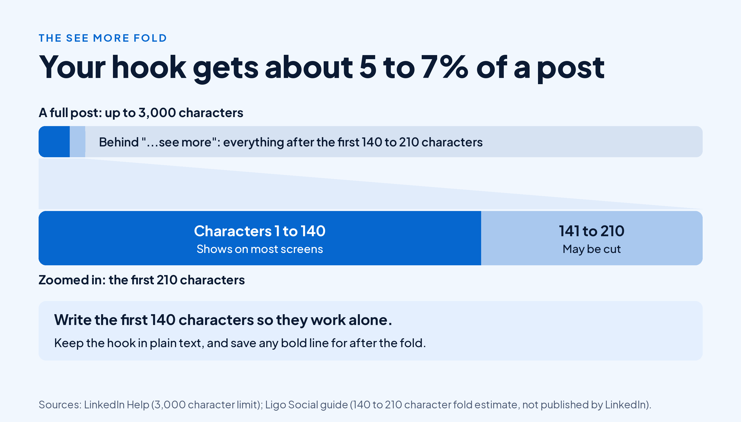
That means your opening is a tiny share of a 3,000 character post, and it does most of the work. Three things follow:
- Put the hook in plain text. It's the line people search, share and quote, so don't style it.
- Use line breaks with care up top. Every blank line in the first lines pushes your hook closer to the cut.
- Save bold for after the fold, where it helps a reader who clicked through find the key point.
Check the fold before you post. Our free tool for previewing the text above "see more" shows where the cut lands, and in Draftly the live LinkedIn preview in the editor shows the post on desktop and mobile, with your photo and name, before you publish. For how the feed picks which posts get that first glance, see how the LinkedIn feed decides what to show.
Takeaway: Write your first 140 characters to stand on their own, and preview the fold on a phone screen.
Formatting Your LinkedIn Profile: Headline, About and Experience
Your profile is where styled text costs the most, because it's what recruiters and buyers search.
- Name: keep it plain. A styled name won't match when someone types it into search.
- Headline: keep job titles and skills plain. A separator like | or • between phrases is safe and readable.
- About: use line breaks and short paragraphs, and plain text bullets for a list of results.
- Experience: one line per result, starting with • or a number, with the metric in plain text.
If you want one styled element, use it for a short label that nobody would search for, like a section marker in your About. Our guide to writing your Experience section has layouts for each role that rely on line breaks alone.
Takeaway: Style nothing a recruiter might search for, and let line breaks do the formatting in your profile.
A Formatted LinkedIn Post Template You Can Copy
Here's a structure that uses only what LinkedIn supports, plus one bolded line. Swap the brackets for your own content.
[One sentence hook with the result or the surprise]
[Two lines of context: what happened and why it matters]
[𝗧𝗵𝗲 𝗼𝗻𝗲 𝗹𝗶𝗻𝗲 𝘆𝗼𝘂 𝘄𝗮𝗻𝘁 𝗽𝗲𝗼𝗽𝗹𝗲 𝘁𝗼 𝗿𝗲𝗺𝗲𝗺𝗯𝗲𝗿]
1. [First step or lesson]
2. [Second step or lesson]
3. [Third step or lesson]
[One line on what you'd do differently]
[A question for readers]
#[topic] #[topic]
Here's how it reads filled in:
We cut our sales demo from 45 minutes to 20, and more deals closed.
Prospects kept tuning out during the feature tour. So we dropped it.
𝗦𝗵𝗼𝗿𝘁𝗲𝗿 𝗱𝗲𝗺𝗼𝘀, 𝗺𝗼𝗿𝗲 𝘆𝗲𝘀𝗲𝘀.
1. Open with their problem, in their words
2. Show the one workflow that solves it
3. Spend the rest on their questions
I'd have cut it sooner.
How long are your demos?
#sales #saas
The hook fits well inside 140 characters, the only styled line sits below the fold, and the list and hashtags are plain text. For more on how long the full post should run, see our guide to choosing how long a LinkedIn post should be, and for the rest of the writing process, read our guide to creating LinkedIn content that gets read.
If your hook runs past the fold, Draftly's AI editor for LinkedIn posts can shorten or clarify just the line you highlight, with one click, while the rest of the draft stays as you wrote it.
Takeaway: Structure first, styling last: one bold line, plain everything else.
Conclusion
LinkedIn posts don't support bold or italics natively, so use a text formatter: type your text, choose a style, then copy and paste it into the composer. Line breaks, plain text bullets and pasted URLs need no tool, and articles give you real formatting and linked words.
Keep styling to one short line below the fold, leave keywords, hashtags and mentions plain, and preview the first 140 characters on a phone before you post.
Want to write, preview and schedule well formatted posts in one place? Start Draftly's free plan and create five LinkedIn posts a month, no card needed.